
The ‘F-Pattern’ Secret: How Your Customers Actually Read Your Website
Let's get some reality in the way before we go further. No doubt that you have spent plenty of time, or maybe days, building your website to perfection. Perfect colors, perfect wording- every element matters. However, the thing is, unfortunately, your visitors do not pay attention to it as you believe they do.
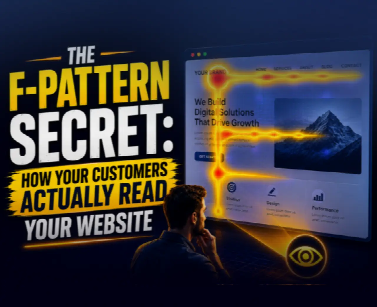
The fact is, most of your visitors do not even bother to read the pages – they scan them, yet in quite a consistent manner. It might sound incredible, but it is the truth! Several times, scientists conducted an experiment on tracking eye movements and found out how people look through the pages. This pattern is known as an F-Pattern.
So… What Is the F-Pattern?
Just try to imagine yourself looking at a webpage and moving your eyes. The experiment showed that the pattern is highly predictable for humans and includes three major steps: first, users tend to start reading from the top-left part, then move towards the right (first line), going down a little bit and reading to the right again (second shorter line), then moving down to the left part.
When you put all these together, you come up with an “F-shaped” layout. Take just a minute and remember visiting a particular website on the web. Are you going to study the whole content thoroughly, or would you prefer to read only the headline and several sentences?
Well, there you go – the famous F-shaped layout.
Why This Matters More Than You Think
Here comes the interesting part, or better to say, the uncomfortable one. If your website does not match people’s reading habits, they will ignore all the important things on the site, your CTA will fail to work, and the rate of conversion will drop without any special explanation.
It means that in addition to your content, you have to pay attention to where it should be placed on your web page. It’s unlikely that people are there, or maybe your “Buy Now” button is located right in the center of the page. Your visitor? They may have already decided to leave. That’s the hidden cost of ignoring user psychology.
The First 5 Seconds: Where Everything Is Decided
What does the person who comes to your website see first? Whatever appears in the upper-left and upper-center sections of the screen receives the most attention. Yet, most websites make this valuable real estate work for them by putting boring titles such as “Welcome to our Website,” unclear messages, or nothing of any significance.
Instead, the section must immediately convey three things: “Who am I dealing with?” “Am I in the right place?” “What is in it for me?” Unless you convey these points to the visitor right away, you have already lost him/her.
Let’s Break Down the F-Pattern in Action
1. The Top Horizontal Line (Your Headline Zone)
Users pay the most attention to this area. So ask yourself: Is your headline clear or clever?
Does it communicate value instantly?
Would a stranger understand it in 3 seconds?
Here’s a simple rule:
Clarity beats creativity—every time.
Instead of:
“Reimagining the Future of Digital Synergy”
Try:
“Build High-Converting Websites Without Coding”
One tells a story.
The other drives action.
2. The Second Horizontal Line (Your Hook)
After the headline, users scan a bit lower. This is where your subheadline or supporting text lives. This section should reinforce your main message, add a key benefit, and reduce confusion. Think of it as the answer to - how does this help me?” If your headline pulls them in, this section keeps them there.
3. The Vertical Scan (Your Content Spine)
Now comes the vertical movement. Users scroll down the left side, scanning for keywords, bullet points, bold text, and visual breaks. They’re not reading line by line; they’re hunting. So, if your content looks like a dense wall of text, you’ve already lost them.
The Silent Killer: Dense Paragraphs
Well, when we come across chunks of text, what is our reaction? We skip it all! Well, that is what our readers will do too. Even if your content is top-notch, it won’t make any difference to anyone if it's hard to read. That is precisely why formatting is an integral part of psychology, and following the F-pattern entails using short paragraphs, headings for separating content, and highlighting important phrases.
The Power of Strategic Placement
Let’s talk about something that directly impacts conversions: Where you place your call-to-action (CTA). Most websites treat CTAs like an afterthought, but in reality, placement is everything. Based on the F-pattern:
High-performing CTA zones include:
Top-right area (after headline scan)
Below the subheadline
Along the left-side flow
Repeated as users scroll
Why? Because that’s where attention naturally flows. If your CTA sits outside that flow, it becomes invisible.
A Quick Thought Experiment
Think about going inside a store without proper directions on display. You’ll have no idea where to begin looking and what needs your attention. How long do you think you would stay there? That’s exactly how users feel on a poorly structured website.
Now imagine the opposite of it- clear sections, logical flow, and important items are placed right in front of you. That’s what aligning with the F-pattern does. It makes your work easier, which, in turn, results in higher conversions.
Common Mistakes That Kill Conversions
Let’s call out a few patterns you might recognize:
❌ Centered Everything
While it may look “balanced,” it disrupts natural scanning behavior.
❌ Hidden Value Propositions
If users have to search for your value, they won’t.
❌ Overloading the Top Section
Too many elements competing for attention = confusion.
❌ One CTA at the Bottom
By then, many users are already gone.
How to Apply This Today (Without Redesigning Everything)
There’s no need for a total revamp in order for you to get started with the advantages of that, too. Here are some adjustments you can make immediately:
1. Rewrite Your Headline
Be clear, be precise, and be beneficial
2. Move Key Information Up
If something is vital, put it towards the top.
3. Break Your Content
Turn long paragraphs into short sections and scannable chunks
4. Add Visual Anchors
Use bold text, icons, and spacing to guide the eye.
5. Reposition Your CTA
Never let it get lost in translation. Include it within the flow of the reading experience.
The Bigger Picture: Attention Is Currency
In this day and age, a user’s attention is precious and comes at a premium price. Each second that a user spends on your website is hard-earned, not necessarily granted. The F-pattern gives us an insight into how to increase those seconds: People don’t hate reading; people hate effort. If it feels like work, they leave.
Final Thought: Design With Intent
Next time you look at your website, don’t ask: “Does this look good?” Ask “Where will the eye go first?” “What will they see next?” Am I guiding them... or confusing them?”
Once you design based on attention, everything changes. Your content gains clarity, your design gains effectiveness, and conversions? It all starts coming together
Written by
Simer Ghuman
Webcooks Team
Keep reading
Related Posts

Why Your YouTube Videos Aren’t Getting Views — YouTube SEO Hacks That Actually Matter in 2026
Why Nobody Watches Your YouTube Videos to the End - A Content Creation Framework That Holds Attention